| Ever since the iPhone was introduced in 2007, the phone has looked pretty much the same. Okay, the hardware has gotten sleeker, the phone has gotten faster, the screen has gotten slightly taller and the camera improvements are impressive. But the part of the phone you interact with every single day -- the touchscreen and the software on it -- has remained relatively unchanged. Parts like the yellow-hued Notes app, the gray and blue colored Calendar or the rounded icons all look as they did on that day in June 2007 when people first lined up for the iPhone. That changes today with the launch of iOS 7, Apple's latest software for its iPad and iPhone. Apple's chief of design Jony Ive has said "while iOS 7 is completely new" it is "instantly familiar." It is a serious change, but is it one you should make today?
You can think of iOS 7 like an episode of "Trading Spaces." Apple hasn't changed the actual house layout, it hasn't really torn down any staircases or built out a back porch, but it has replaced all the furniture, repainted the walls and redone the floors. Icons are new (though not always better), menus are translucent and with new shades of light blues and purples, the keyboard is cleaner and everything is generally tidier. The overall design does take some getting used to, especially the zooms and swooshes that appear when you transition between screens. There is also a Parallax effect, meaning when you move the phone, parts of the software move. It's a fun trick, but that's about it.
But despite those appearance changes, which I quickly adapted to, most things are still in the same place. Your apps are on the home screen, your apps go into folders on that home screen and you can swipe from the top of the screen down to see your notifications. Some things have been relocated. For instance, you can't swipe to the left anymore to get to Search, instead you swipe down from the middle of the home screen to get to the search field. It's been the most jarring change for me and not exactly a welcoming one; at times I mistakenly swipe down and get the notification tray. Yet, after a week of using the software, the general novelty and the newness wears off and it begins to feel like home. Much Needed Feature Additions 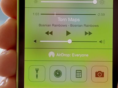 Apple Control Center in iOS 7 gives you quick access to your settings and the built-in flashlight. The multitasking features are also improved. Now when you double-tap on the home button you are presented with images of the open apps. Instead of having to close the apps by tapping a small red minus button you can swipe up to kill the app. It's similar to how apps work in Android, I just wish there was a "kill all" switch instead of having to swipe through each app.
App Refreshes via Technology - Google News http://news.google.com/news/url?sa=t&fd=R&usg=AFQjCNF_8ZLIeDN9jmy9ro1idm8BL36pMg&url=http://abcnews.go.com/Technology/ios-review-apples-big-change-means-worthwhile-upgrade/story?id=20290551 | |||
| | |||
| | |||
|
iOS 7 Review: Apple's Big Change Means A Worthwhile Upgrade For You - ABC News
Related Posts:
 Samsung grows smartphone market share - Irish Independent
- Galaxy Note 3 To Have 720p Flexible OLED Display - 3G.co.uk
- Tata Motors hits out at move to allow quadricycles; Rajiv Bajaj rubbishes ... - Economic Times
- LG promises smartphone with flexible OLED display this year - The Verge
- HP Slate 7 launched in US: Slate 7 vs iPad Mini vs Google Nexus 7 specs, price ... - Northern Voices Online


0 comments:
Post a Comment